 Dana Library Hand is a font created by Margo Burns, margoburns@gmail.com
Download the OpenType and TrueType versions of it here: DanaLibraryHand_v1.3.zip
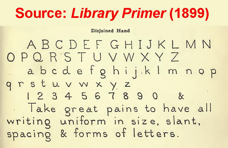
Dana Library Hand is inspired by a recommended penmanship style for librarians to use when writing out card catalogue cards (see right), and closely resembles the style of penmanship I learned in grade school in northern Vermont in the early 1960s. I first learned about it in an article by Ella Morton in February 2017: Library Hand, the Fastidiously Neat Penmanship Style Made for Card Catalogs . The base sample I used came from the facsimile of the Disjoined Hand on page 71 of the book Library Primer by John Cotton Dana, published in 1899, a public domain book which is available at https://archive.org/details/primerlibrary00danarich
 It has Regular, Italic, Bold, and Bold Italic styles.
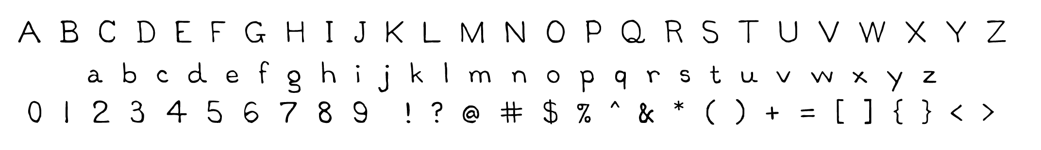
There are 650+ glyphs in the font. In addition to English, the font is designed to be compatible with Catalán, Czech, Danish, Dutch, Estonian, Finnish, French, German, Hungarian, Icelandic, Latvian, Lithuanian, Norwegian, Old English, Polish, Portuguese, Spanish, Swedish, and Turkish, including special glyphs and diacritics used by these languages. Please contact me if you find that the font is missing any glyphs used by these languages.
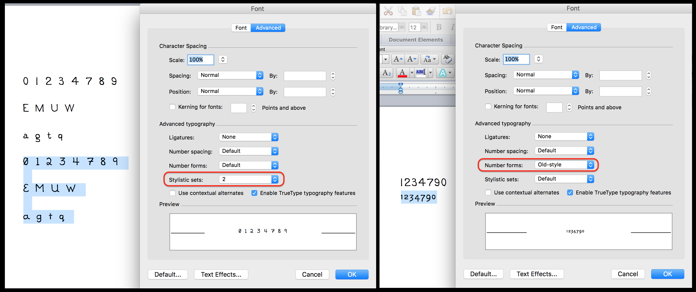
The font includes Old Style alternates for numbers (see below), small caps, superscript & subscript numeral glyphs, some alternate glyphs (EMUW agqt 01234789) as Stylistic Set 02 (see below), Unicode Roman upper case and lower case numerals, discretionary ligatures for half, quarters, thirds, & eighths, and an assortment of Unicode non-alphanumeric glyphs that interested me. Please refer to the PDF document in this release folder for the complete inventory of glyphs and their Unicode code points: Dana Library Hand Glyph Inventory - version 1.3.pdf
To access the Unicode glyphs on a Mac, go to System Preferences, select the International preferences. From the Input Sources tab, click the + in the lower left to add an input method. Scroll all the way down and check the box next to "Unicode Hex Input". You will now be able to switch to "Unicode Hex Input" in the menu bar. To insert a Unicode character, hold down the ALT (option) key and type the hexadecimal Unicode value from the Glyph Inventory. Windows users do not need to change any settings to do this.
There is a small set of alternate glyphs that can be accessed in the Glyph panel in Adobe products. To access them in MS Word, go to the menu Format > Font > Advanced tab to access Stylistic Set 2 (see below.) To show the kerning properly in MS Word, you have to turn on kerning, which is not set by default.
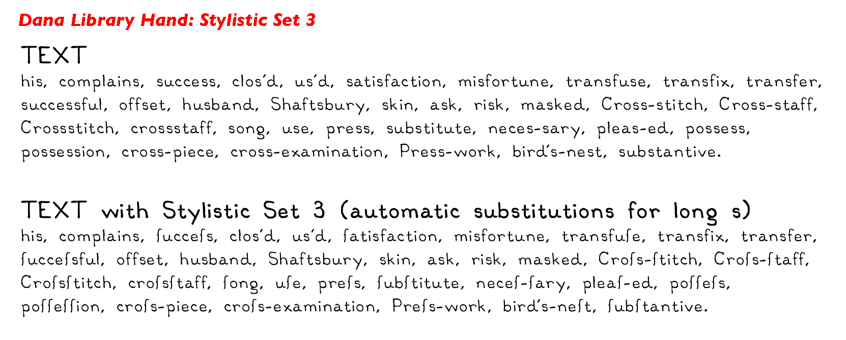 Stylistic Set 3 allows you to substitute s's for the long s, according to certain contextual rules (see right). There is no reason to do this unless, for some strange reason, you really want to make your text look like it was written in the 17th century, because everyone will think there are f's in the text. I added this only because of the programming challenge to make it work properly. For the rules, I used what Andrew West had posted on his blog in 2006, but his blog is no longer on-line. Although it's possible to see it via the Wayback Machine at the Internet Archive, Werner Lemberg transformed the original blog post (with minor modifications) into this paper and published it in TUGboat, Volume 32 (2011), No. 1. You can download it as a PDF: Rules for long s [PDF].
When two of the same lower-case letter are next to each other, Stylistic Set 4 changes the second letter to a slightly different version of the same letter. The difference may be imperceptible, but the differences are there. This has been added so that doublets look more like real handwriting than a font. See: http://blogs.sas.com/content/iml/2014/10/03/double-letter-bigrams.html
To the extent possible under law, as the designer, I dedicate all copyright and related and neighboring rights to this font to the public domain worldwide. This font is distributed without any warranty. You can copy, modify, and distribute the font, even for commercial purposes, all without asking permission. This font is entirely free.
Attribution would be appreciated, especially if someone likes my font and wants to see what else I've done. If you distribute a version of the font with changes you've made, please be kind enough to include a README file that explains that.
Soon after the first release of Dana Library Hand, I had feedback from various people, which I have incorporated into new versions. I am always interested in feedback, questions and comments. If you like this font, please check back in occasionally for the latest version!
Help Accessing Alternate Glyphs in MS Word:
Enjoy!
Margo